Split testing or A/B testing is one of the easiest methods of increasing conversions and adding a little more R to your ROI. All sorts of savvy businesses and multi-nationals use these killer techniques to gain massive insights on visitor behavior and conversion rates.
How would a 1% increase in conversions affect your company? What about a 5% increase in conversions or even a 10% boost in conversions?
Making a positive impression on your conversion rate is priceless and it’s not as complicated as you think.
If you can maneuver your car in and out of your parking spot each day you will have no problem creating your own split tests.
After all, what could be better than figuring out the best online promotional and marketing strategies for your business?
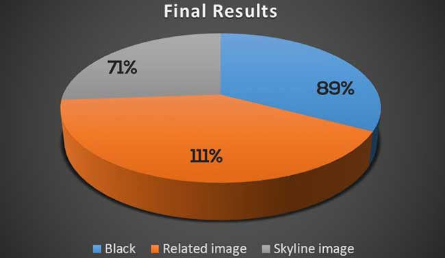
We have increased conversion rates for our clients 22%-40% just by change the background of certain important pages on their websites.
Split testing is like dropping two heavyweight boxers into the ring and letting them duke it out until a winner emerges.
Instead of heavyweight boxers, we’re throwing our headlines, images and website copy (to name but a few) into the ring. We then sit back and wait to see which element will emerge victorious.
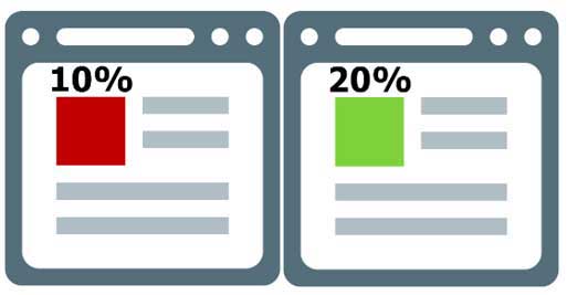
The Green image converts 10% better than the Red image. No prizes for guessing which color to run with here.
If our statistics reveal a certain image (or any other element we are testing) performs better than the other options, it makes good sense to run with it.
Of course, we’re not limited to just background images. Split testing allows you to test nearly everything on your website or other marketing materials including headlines, buttons, banners, calls to action (CTA) and so on.
Finding an element that performs better than the alternatives will make much better use of your online traffic or marketing material.
Split testing has existed in some form or another for as long as there have been merchants putting up signs and displaying their wares.
While split testing came to prominence in the 1990’s the concepts have existed in some form or another for as long as anyone can remember.
One of the earliest documented studies is known as the Student’s t-test and was conducted in 1908 by William Sealy Gosset.
Gosset actually created and used the t-test as an economical way to monitor the quality of stout. In fact, this test can be used to determine if any two sets of data are significantly different from each other. It is one of the most commonly used techniques for testing a hypothesis on the basis of a difference between sample means.
Variations of this test have been used in everything from the medical field, the engineering industry and even population density studies.
The Internet, Ever-Improving Software and Mobile Apps have made split testing accessible
So while the concepts themselves are not entirely new, the evolution of the Internet, ever-improving software and mobile apps have made split testing more accessible and practical.
By the year 2000, tech giant Google was running split tests on everything including the number of search results to display on their search results pages.
Today Google’s split tests number well into the tens of thousands.
Up to now we’ve discussed just one variant of split testing, i.e. A/B Testing.
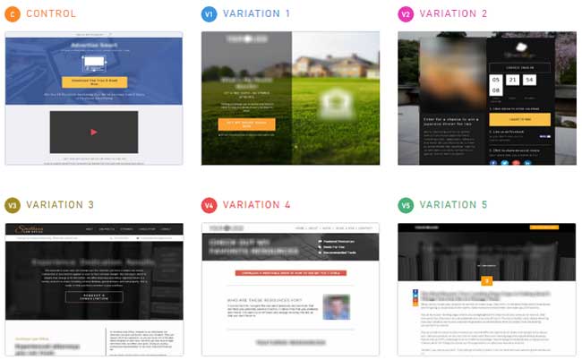
A/B Testing with multiple variations
You will find that there are a number of different split testing methodologies you can adopt to improve your performance.
The most popular methods include:
- A/B Testing
- Multivariate Testing
- Taguchi Methods
- Web Usability
These additional methods of split testing can be described as:
Multivariate Testing
Allows you to carry out many tests concurrently. Testing which headline to use, text, images, prices, offers, and buttons can be conducted in a single test. In a multivariate split test, visitors see different combinations of these elements at the same time.
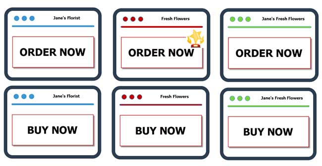
Testing multiple elements at the same time
The results show which elements perform best and this data provides the info required to create a page featuring only the highest converting elements.
Taguchi Methods
The Taguchi Method is named after Mr. Genichi Taguchi, a Japanese engineer and statistician. Taguchi has been applied to everything from automotive R&D to advertising.

Taguchi experiments showing tested elements
Taguchi multivariate testing tools can gather results based on fewer tests than classic A/B testing would require but the jury is still divided on Taguchi and the validity of results.
Web Usability
A technique used to evaluate a website by testing it on users. This is a great way to improve the user experience on your website. It highlights sticky areas that could be improved.
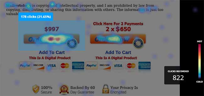
Heat map showing Order page clicks
In this type of web testing the idea is to create a scenario wherein a person performs a list of tasks that a first time website visitor is likely to perform. These results are in the form of heat maps showing the most clicked or scrolled areas of the site.
Focus on things that are most likely to have a huge IMPACT!
With so many options for testing and improving the elements on your web site it can be easy to go overboard. As with many things in life, moderation is key.
There’s no need to start testing every element on your web site immediately to see an improvement. In fact, this can be counter-productive.
Instead, focus on the things that are most likely to have a big impact. Start with the simplest elements you can and work your way through all over time. Let’s take a look at an example.
How ONE simple change improved our conversion rate by over 40%
Here’s an example of a split test that we conducted for one of our clients. This particular client releases new products on a regular basis and are always keen on us running a few tests for them to determine areas where we can improve their conversions. So this particular test was run across four of their most recent product launches and the results were quite impressive.
We picked an element of their website that is usually overlooked. In an attempt to boost conversions, we decided to test three versions of their sales page with three different background images.
This simple experiment turned out to have a massive impact.
Here are the parameters of the split test:

Essentially, all the content on the three pages remained exactly the same. In fact, all other elements of the web page were identical. The only difference was the background image being used.

During the first product launch the test pages were created and added to our split testing software. The split testing software evenly distributed the client’s website visitors to one of the three pages with a different background image. At the end of the split test, the page with the black background emerged as the strongest.
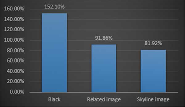
Armed with this information, we simply disabled the pages with poor performing background images and let the winning page be shown to all our client’s website visitors.
In our client’s second product launch we conducted the same split test to see which background image produced better conversions.
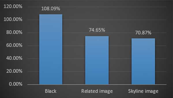
As you can see on the chart above, the black background had once again proven to convert better than the alternatives by more than 25%.
As with the previous test, once we had gathered enough data all we had to do was simply pause or disable the pages with low conversion rates so that the winning page could be shown to the majority of our client’s website visitors.
Pages with black backgrounds were converting between 25% and 50% better than the alternatives
At this stage we had seen that after 2 product launches a page that contains a black background was converting better than any of the alternatives.
This was due to change soon.
During our client’s next launch we continued testing the champion black background, expecting similar results, but we were in for a surprise.
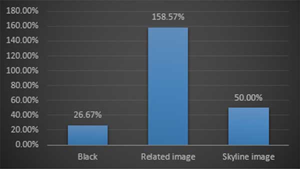
As you can see on the chart above, the page with the product related image on the background had dominated the test.
It converted better than the other pages in the test and was set to be the page that the majority of our client’s website visitors would view upon entering the site.
With the results over the last 3 tests split (pardon the pun) between plain black backgrounds and product related backgrounds we decided to run this test again on our next launch.
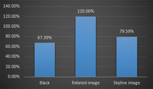
As you can see, the results once again favored the web page that contained the related product image.
The decision to pause or disable the poor performing pages was taken and the page with the product related image was made active to all client’s website visitors.
Here’s what our client’s final results across 4 product launches looked like:
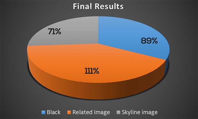
While the black backgrounds dominated in the first two tests, the product related background images had overtaken it and had proven to be the highest converting page by 22% to 40%.
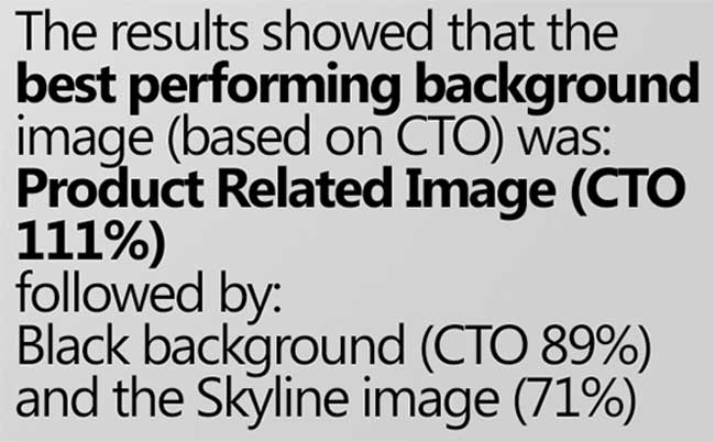
Through split testing we were able to increase our client’s conversion rates between 22%-40% across four of their latest product launches. Needless to say, our client was quite pleased with the results we were able to achieve with a few simple tests. Here’s a look at the final statistics at the end of the split test:
By now you should have a pretty good understanding of how split testing works and why it is beneficial to companies and organizations that invest in advertising.
Split testing helps you get more bang for your marketing and advertising bucks!
Running a few simple split tests with a sample group allows you to identify the highest converting combination of web page elements on your pages.
With your split test data you can tweak your web pages and/or offers and place all the elements on the page in their highest converting configurations before you start pushing large volumes of traffic to your web pages.
So that was a pretty straightforward case study to help you grasp the most important split testing concepts.
Let’s now take a look at a different case study from one of our other clients.
Recently we were contacted by a client who wanted to increase the number of leads they acquired from their existing subscriber and list building campaigns.
The business model was quite simple, the client would drive traffic to an optin or subscriber page offering visitors a free downloadable report. If the visitors signed up, they were added on to a mailing list and taken to a download page where they could get the report.
We looked at the clients existing optin pages and decided to create a number of different optin pages to split test. Here are the actual variations we created:



Even a 1% increase in conversions can have a massive impact on your bottom line
We started with some of our highest converting optin pages and inserted the client’s graphics and other information.
Once the pages were ready it was simply a matter of segmenting a test group that would be involved in the test and starting the experiment.
It didn’t take too long to start seeing certain pages were performing better than the others.
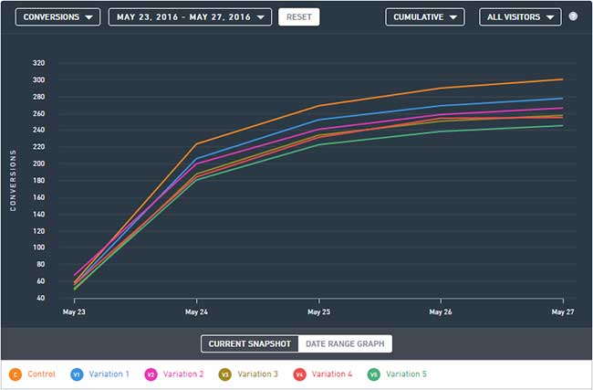
As you can see on the chart above, the Control page was head and shoulders above the rest of the test pages in terms of conversions but that doesn’t exactly tell the full story.
Most people would look at these test statistics and come to the conclusion that the highest converting page is the Control but they would be terribly wrong.
Just because a particular page has more conversions than the other pages in the test it does not mean that it is the highest converting page.
These results clearly show that more visitors subscribed to the client’s mailing list when they visited the Control page (orange colored bar). That’s more than any other page in the test yet it is not the highest converting page in this test.
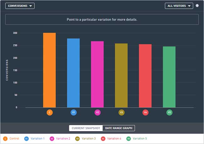
Would you believe that the winner of this test is actually Variation 2 (purple colored bar)?
So why is that? Heck, even Variation 1 (blue colored bar) had more conversions than Variation 2 in this test.
The answer is quite simple. It all comes down to Conversion Rates and NOT the number of Conversions.
Remember, we are using a piece of software to split traffic to the different page variations included in our split test. As a result, some of the pages will get more visitors that other pages.
What this all boils down to is that while the Control page got more subscribers it also got more visitors that viewed the page. This is why we rely on Conversion rates to identify the winning variation. Conversion rates are easy to calculate. We simply take the number of conversions and divide that by the number of total visits to the page.
For example, if you had 50 conversions from 1,000 visitors, your conversion rate would be 5%, since 50 ÷ 1,000 = 5%
The results of our split test become a lot clearer when we view and compare the conversion rates instead. Let’s start with the Control page:
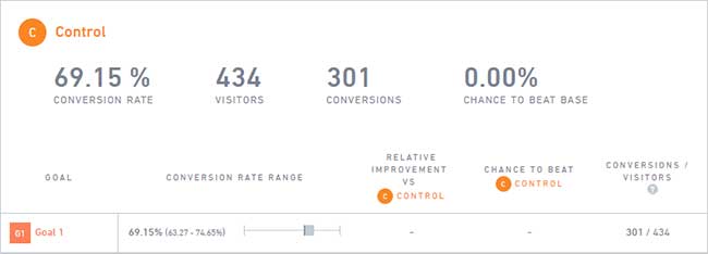
As you can see, this particular page had a total of 434 visitors of which 301 visitors had subscribed and reached the final goal. That gives us a healthy Conversion Rate of 69.15% for this particular version of the page.
Let’s look at Variation 1:
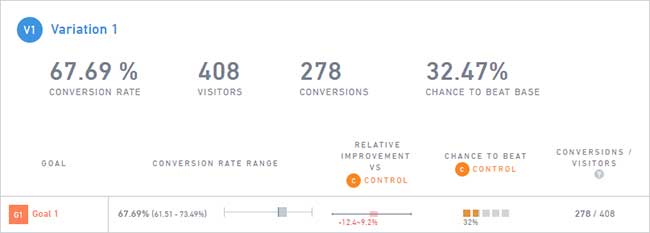
This variation also appeared to have performed better than the eventual winner of the test (Variation 2) but as you can see, it only converted at 67.69% which is just short of the Control.
You’ll also notice that the number of visitors to the Variation 1 page is slightly lower compared to the Control.
This is actually quite common as nearly all split testing software available today will find it very difficult to send exactly the same number of visitors to all variations in a split test at any given time. Now let’s take a look at Variation 2 which won the split test:
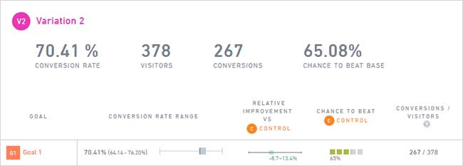
Here you can see that Variation 2 had a higher Conversion Rate compared to Variation 1 and the Control even though it had fewer visitors to the page and fewer subscribers reaching the goal.
The key thing to be aware of is the fact that a higher percentage of visitors would eventually go on to perform the desired action (in this case go on to subscribe to the mailing list).
Now, you might be thinking that the difference between Variation 2 and the Control conversion rates is only 1.26% so what’s the big deal?
Well, a tiny difference of 1.26% could determine whether you end up driving a little hatchback or a sports car.
Yes, it’s that important!
Sure, it doesn’t seem like a big deal right now but let’s run a few numbers and see exactly how powerful this little improvement can be.
A tiny difference of 1.26% could determine whether you end up driving a little hatchback or a sports car
A 1.26% difference between the control and variation 2 pages translates to a whopping $252000.00 increase in sales.
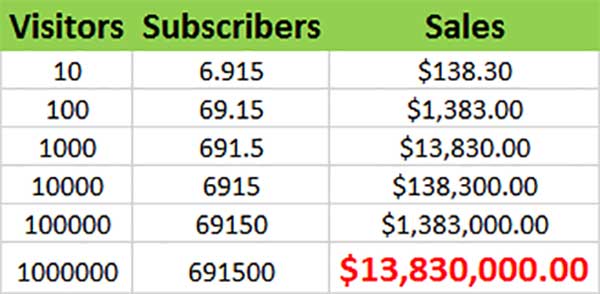
Now that we know the actual conversion rates of our pages we can extrapolate how they would perform with more traffic. Let’s compare the Control page which converts at 69.15% and the Variation 2 page which converts only slightly better at 70.41%.
Let’s assume that every subscriber has a value of $20 to our client. This means that after subscribing to the list, the subscriber would go on to complete purchases from the client to the value of $20 over the lifetime of the subscription.
We’ll start with the Control page:
If 10 visitors went to the Control page, we know that at least 6.915 visitors would go on to subscribe and if we attribute a value to these subscribers, we can look forward to at least $138.30 in sales from them over time.
Now let’s look at the Variation 2 page:
If 10 visitors went to the Control page, we know that at least 7.040 visitors would go on to subscribe and if we attribute a value to these subscribers, we can look forward to at least $140.80 in sales from them over time.
Sure, that’s not a huge difference at this stage it would hardly set the world alight but watch what happens when we take this a few steps further…
What would happen if we sent 10,000 or a 100000 or more visitors to the pages? Let’s start with the Control which converts at 69.15%
And now let’s do the same for the split test winner, Variation 2…
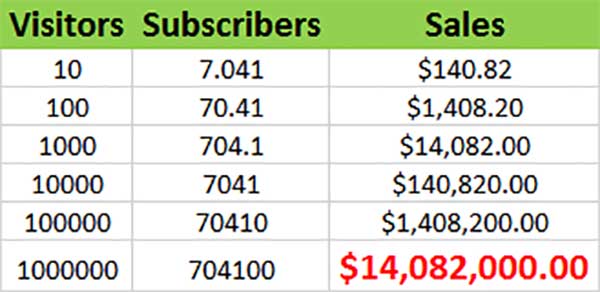
The difference is massive when you have more visitors accessing the pages.
A 1.26% difference between the Control and Variation 2 pages translates to a whopping $252000.00 increase in sales.
And that my friend, is the true power of split testing. By now you’ve probably thought of many things you’d like to split test. Some of the best split testing software packages worth checking out are:
www.vwo.com,
www.optimizely.com and
www.kissmetrics.com.
Start small and run your tests on significant segments of your audience to produce valid results. With a little practice, you’ll be boosting your own conversions in no time.





2 Comments
John
What a great article. Just about everything you need to know about testing.
Mark McRae
Thanks John!